Is there a way to backup and restore the provisioning of filters & charts?
Partly.
The various app configuration parameters, including filter settings, are stored in:
\Users\[YourName]\AppData\Roaming\ViewProp\state.xml
If you make a copy of that file, you can restore it in-place at a later time (best to only read and write the file when ViewProp isn’t running).
Note that the file is only updated when you select File > Save settings.
However, it’s not possible to explicitly backup the content of the charts. The closest you can get at the moment is to capture the incoming spot logs, and then read them in after restarting the app, using File > Import. The logs (from the beginning of time, btw) are located in: … \ViewProp\logs
Is there a way to have a filter that will count spots on a specific band which are unique over a period of 1h time?
Depends on what you mean by “unique.” Duplicate spots – same calls, same mode, same or nearly the same time, etc. – are already ignored. However, spots with just the same calls are counted again, after an interval long enough to be confident that the new spot is for a different transmission (during which propagation conditions may well have changed). It’s not possible at the moment to configure a filter related to specific time intervals. It is possible to adjust how long spots stay on the Path Grid and the map, in case that’s helpful.
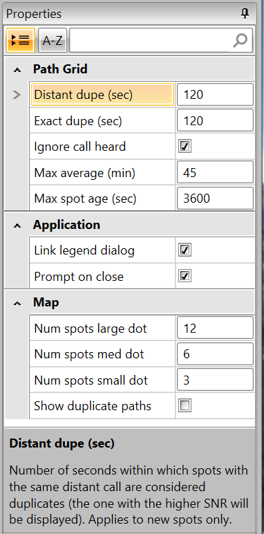
The Path Grid-related parameters can be accessed and changed from the Properties panel at the upper right of the window. If you click on one, some help text is displayed at the bottom.
Distant dupe (default = 120): Number of seconds within which spots with the same distant call are considered duplicates (the one with the higher SNR will be displayed). Applies to new spots only.
Exact dupe (default = 120): Number of seconds within which spots with the same DE, DX and freq are considered exact duplicates. Applies to new spots only.
Max average (default = 45): Max spot age for it to be used in the moving average SNR, in minutes.
Max spot age (default = 3600): How long spots stay on the Path Grid and the map, in seconds. Applies to new spots only.
Not all changes take effect instantly; it can take a minute or so. In case you’re using Band Lines, there is also a time-related setting for how long they last (default = 3600 seconds, same as Path Grid spots).
Accessible from Settings > Bands > Show Lines.

Would it be possible at some point to add the current MUF to the Solar tab?
It’s possible to use ViewProp to visualize the current MUF, in two ways.
First, you can use the map for a true path-oriented approach, by finding the highest frequency spots in your chosen area of interest (enabling lines on the map may make this a bit easier).
Or you can configure bar charts to let you see the highest frequency bands that are active on an “averaged” basis. The default for the charts is to include all spots globally, but you can easily narrow down the selected location by a bunch of different filter criteria. Bar charts have the advantage of letting you see the history over the last 24 hours, where the map is only the last hour.
Unfortunately, the catch is that someone has to be transmitting from your area of interest–and on the right frequencies–for this to fully work. The plus side is that it’s much more accurate than tools based on long-term averages, such as VOACAP.
Anyway, to have the Map keep its settings every time (DX Atlas)?
Some yes, some no.
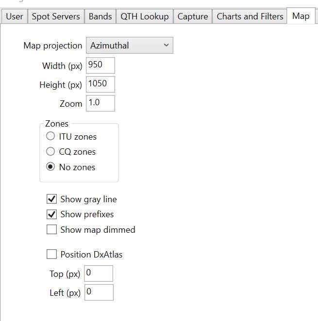
If you go to Settings > Map, you can change a number of initial map settings, including the default position (see the screenshot below).
Those settings are “live,” in the sense that DxAtlas will respond immediately to any changes. They are also uni-directional, in that changes you make from the DxAtlas UI are not reflected there.
Those settings are persistent, provided you either exit ViewProp cleanly (File > Exit), or if you explicitly save them (File > Save settings). If you kill VP or if your PC crashes before you do one of those things, the changes will be lost (as with all other settings).
Other map-related settings, such as Lines and Slices, as well as Bands, Filters and Antennas, are persistent in a similar way.
However, the actual content on the map is not persistent. The specific spots will reset whenever VP is restarted, along with the contents of the Path Grid and the Bar Charts.

How can I provision a brand-new tab under “Charts and Filters”? One that I can further setup and have it finally visualizing data under “Bar Charts”
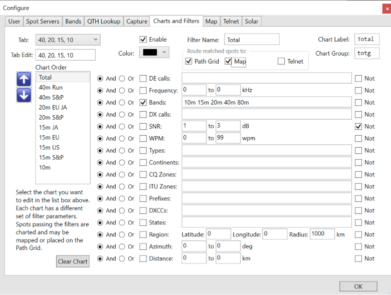
The way Charts and Filters works is that first, you select the tab (upper left) of the bar charts you want to change. There are only two tabs, each with 10 bar charts—you can’t add a third. You can set the name of each tab using “Tab Edit.” Then select the bar chart you want to edit from the list in the Chart Order section. You can change the order the charts are displayed in, using the up and down arrows to the left.
Then you can set the name & label of the filter, chart group, and color. Set the filters to the right, using a Boolean combination of your desired criteria (checkbox to enable + AND/OR/NOT). If you hover the mouse over the text box for parameters, you should see examples.
If you want the spots selected by the filter to show up on the Path Grid or the Map or the output telnet connection, be sure to check those boxes. A spot only needs to be selected by one filter so-enabled to show up. If a spot is selected by more than one filter, it will only be displayed once.

